How to design the perfect logo!
Think of your logo as the face of your company. It's often the first thing your customer will see, a point of recognition. A well-designed logo can convey exactly what your brand identity is at a glance. We've consulted the experts and got their tips on how to design the perfect logo.
Hopefully you have already given your brand identity a great deal of thought when preparing your business plan.
Now it's time to plan the visual representation of your business. What does your business look like to you? Close your eyes and image it. What colours resonate with your business? What's the inspiration for your business? What sort of look appeals to you? What typeface are you drawn to? And finally, what message do you want to send to someone when they have that first look at your socials or website?
At this stage, when creating my businesses, I've usually had some pretty definite ideas on what appealed to me and what didn't. How did I find those? Hours, no, probably days spent trawling through Pinterest, Instagram and the worldwide web, making notes or taking snapshots of what grabbed me. I spent time putting together my brand board: colours, fonts, inspiration and mood.
These days, with great sites like Canva, Wix, Looka, Themeforest and Shopify, to name a few, it's easy to create your own brand feel, theme, logo and website using curated templates, designs and colours. If you have something definitive in mind but don't have the skills to create a logo on your own then ask for recommendations or consider Etsy or Airtasker. In seconds, yes, I really mean seconds, someone will have their hand up wanting to help you with your task.
Want to create the perfect logo? Read these tips:
What's in a colour?
According to some research, the colour used in your brand logo and advertising can impact both brand recognition and sales. Here are some emotions and thoughts colour can convey.
Red – passion, love, excitement, warmth and perhaps most importantly urgency. Red is said to encourage shoppers to buy on impulse.
Orange – friendly, cheerful, confident, energetic, affordable, good value. Orange can be considered a call to action; the colour often used in discount store branding.
Yellow – happiness, optimism, clarity, frustration. A colour that infants are said to first relate to; the colour is often associated with baby products. Too much yellow is said to cause anxiety!
Green – natural, health, new growth, harmony, tranquillity, wealth, fertility, luck. Green can also convey an eco-friendly message to customers.
Blue – security, trust, confidence, loyalty, strength. Blu is said to increase productivity; perhaps worth a try in the office!
Purple, Indigo, Violet – imaginative, creative, spiritual, success, wisdom, affluence. Purple is often associated with luxury branding. Brands looking to target a female audience also use purple.
Pink – calming, femininity, love and romance. Representing sweetness and often used in floral logos. The shade of pink used in your branding can make all the difference; blush tones used to appeal to “millennials”, for example, whereas hot pinks tend to convey energy, fun and excitement. Too much pink or the wrong shade may send a message that your brand is strictly “girls only”, so choose pink with care.
Black – professionalism, sophistication, authority, power, exclusivity. A colour used to increase brand recognition.
White – Purity, clarity, cleanliness, perfection. White can convey the simple, straight forward message of a brand. Designers also rely on white to highlight a modern brand or approach to business, minimalism or cleanliness.
Grey – practical, timeless, boring. Grey is an unemotional colour and whilst there can be negatives connotations when using Grey, it can also convey a sense of dependability and conservatism.
Brown – simple, strong, organic, grounded, down-to-earth – Brown can convey a feeling of reliability and that duty and responsibility are paramount.
Multicolour – logos that use multiple colours want to convey a message of inclusivity, showing that they represent a variety of people, cultures or groups.
Keep it simple, make it memorable!
The best logos are the ones people recognise immediately and remember. Who'd have thought that a white apple or black tick would convey much at all, yet these simple, single–coloured images are synonymous with two of the world's largest brands. Admittedly, there's a lot more than a logo behind the success of Apple and Nike, but both of these logos are instantly recognisable shapes and colours. Both logos convey their brand's message in the blink of an eye.
Scalability
Keep in mind that your logo will need to work on a number of platforms. You're after something that will be effective on a business card, signage and maybe even a large billboard. So, make sure it works well whether big or small, and that it still looks good. A good designer can help with proportion and symmetry in design, both of which will help with scalability.
It's a good idea to always use a vector format (that's .pdf format for those with basic design skills like me) so that you can resize your image infinitely. Start your design in black and white, ensure its scalability, and then add colour.
Typeface
Use a custom typeface or at least one that resonates with your brand. Common typefaces can look boring and “everyday” and you want your brand to stand out. Having said that though, don't go too crazy with flourishes or overly complicated typefaces; you want your customers to understand what your brand name. Imagine that you've only got a two–second view of your company logo as it drives by on the back of a cab: would you be able to read the business name?
Target Market
Focus on your target market but don't forget to check your competition. You don't want your customers confusing your brand with another business and going elsewhere.
Seek feedback from a number of people. This is the best way to flush out any hidden meanings, cultural misunderstandings or missing details. Remember though, at the end of the day, the logo should reflect the vision and values at the core of the business. Back your brand, stand up for whatever you choose to put into the public domain, and make sure you're proud of it!
Remember, the more you research and plan, the more likely you are to have an end product that works every time … the first time around!
What you save in time, money and energy will definitely be worth it in the end!
This episode is brought to you by
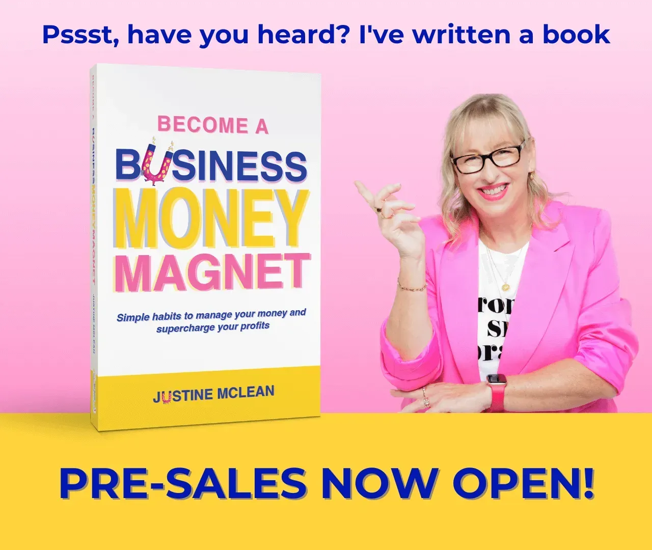
Flossi Creative and Business Money Magnet -
Simple habits to manage your money and supercharge your profits.

Meet The Author
Justine McLean
Business Money Mentor
Justine is the business chick who cares about your profits! With 30 years business experience in retail, ecommerce, service-based business, publishing and insolvency, Justine knows what it takes to start, scale and sell a profitable business. Justine is a registered BAS agent, host of Secrets of Successful Business Podcast and a proud Ambassador for Ladies Finance Club.